Last updated on April 22nd, 2024 at 12:41 pm
In 2019, there were over two million different brands on Amazon.
With so many brands, how on earth are you supposed to stand out?
After all, the barrier to entry for selling on Amazon is extremely low. That means you have hundreds of new brands jumping onto the platform every single day.
The solution is to open an Amazon Storefront.
Today we will go over 5 stunning examples of Amazon Storefronts from brands you’ve probably heard of.
We hope that you can learn from all the things they’re doing right and get inspired to create your own Storefront.
What Is An Amazon Storefront?
Amazon Storefront is essentially your brand’s “mini-website” on Amazon.
It basically acts as a home base for your brand where customers can shop your products away from the main pages of Amazon or the search results.
This means that you have greater control over how you present your brand. And what’s more, your competitor’s products will not be able to appear on your Storefront.
Before Storefronts, people would just browse through Amazon’s endless catalog of products, scrolling through them one by one. It was hard to build a brand because your brand name isn’t very visible on your listing, and you couldn’t really do much to create a strong visual experience for your customers.
Creating a thoughtful Storefront will leave your visiting customers a good first impression and help communicate your brand’s feel, ultimately building rapport and success for your business.
So how do you get started? Well, we believe success leaves clues. If you want to be successful, just look at what other people who are successful are doing… and learn from them!
Here are five Amazon Storefront examples we think really knock the ball out of the park.
Amazon Basics
Starting off this list is none other than Amazon’s flagship brand. After all, we’d think that the creators of Storefront would probably know a thing or two about making it work.
When you visit their homepage, you instantly get a visual of their wide variety of products (and there are a lot). We like how they opted for smaller grid design to allow for a wider array of products to be visible at once. This really fits their brand image of being a one-stop shop for all of your everyday household product needs.
The imagery is clean, simple and straightforward―and I’m sure that’s how their customers feel about the brand. It also makes the vast selection of products less overwhelming by ensuring the customer isn’t overstimulated.
Callaway
This golf retailer has built a beautiful and incredibly user-intuitive Storefront, making it easy for shoppers to find what they need.
Right off the bat, you are greeted with the Callaway logo front and centre.
This immediately helps build brand recognition. Brand recognition is critical for sales if you’re trying to build a brand people want to feel loyal to, because when people recognize it, they’re more willing to buy from you because they’re familiar with your company.
This store’s navigation bar is brilliantly organized making it easy for shoppers to find what they need.
Their front page is filled with stunning high-quality renders of their products. They’ve chosen to have the big grid template so that their products pop, allowing shoppers to zoom in and see every last detail.
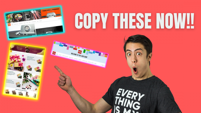
Lego
Lego’s Storefront excels at resonating with their different audiences.
As soon as you land on their Storefront, you’re greeted by their colourful banner image that features their product and their logo.
Lego carries this bright and fun aesthetic throughout their homepage. It also features intuitive categories at the top allowing users to browse based on theme, age, or see latest releases.
What makes them really excel is that they offer personalized recommendations based on your browsing history. This helps convert shoppers because it puts products likely to convert right in front of them.
Now Lego doesn’t just appeal to kids―they have a large adult audience as well. So they make sure to target both accordingly. They keep the bright and colourful theme for kids, but for adults they prefer to use sleek black, white and red themes.
That’s why when designing your Storefront, you need to know who your target audience is, and what design philosophy resonates best with them. And Lego proves that you can appeal to different audiences effectively on the same Storefront.
PK Grills
PK Grills is an emerging outdoor grills brand.
They know the #1 thing in the back of their customers’ minds when they’re looking for their products: food!
That’s why their Amazon store is filled to the brim with mouth-watering images of their grills in action.
In a sub-conscious way, they’re showing you that if you buy their products, you’ll end up with delicious food like the ones in the images. So they’re getting you to associate great food (and all the warm cuddly feelings that go along with it) with their brand.
What’s also great is that for new shoppers, there is a section of “Best Sellers” and “Recommended Products” at the bottom of the homepage.
Godiva
The famous chocolate brand Godiva utilizes appetizing colours and images to entice customers in.
Luxurious photos of chocolate, just like what everyone knows them for, adorn the entire homepage. Each image is overlaid with small icons that shoppers can hover over if they are interested in learning more about the products in the photo.
Godiva also includes a section in their Storefront for gift boxes. By offering this bulk order option, they can capitalize on an upsell opportunity that isn’t normally available in the search results.
BONUS: Advil
This bonus entry comes from a brand I’m sure we’ve all used at some point: Advil.
We thought that Advil’s Storefront is quite interesting because they try to solve this problem―how do you present something boring like Advil in an exciting way?
While rock climbing doesn’t exactly come to mind when you picture Advil, they include a picture of it in their banner image because they’re trying to make an otherwise everyday item exciting.
And when you think about it, the connection does make sense. Advil’s customers are likely suffering from pain that’s preventing them from being active in some way. So what Advil is saying sub-consciously is, if you take our products, you’ll be able to go back to doing whatever exciting activities you normally do. This is because they understand their customers don’t care about their product―they care about the end result of using their product!
Now as for the rest of their store, it does look quite clean. With its many different types of products, Advil places their best sellers front and centre. Its straightforward design makes shopping very simple and painless.
Conclusions
There you have it: 6 of the best looking Storefronts out there.
We hope that this has inspired you to create your own Storefront, as well as give you some ideas you can integrate into it.
For more information about how to create your own Storefront, check out our step-by-step guide here.